Beyond Gold: Elegant Color Combinations for Luxurious Interiors

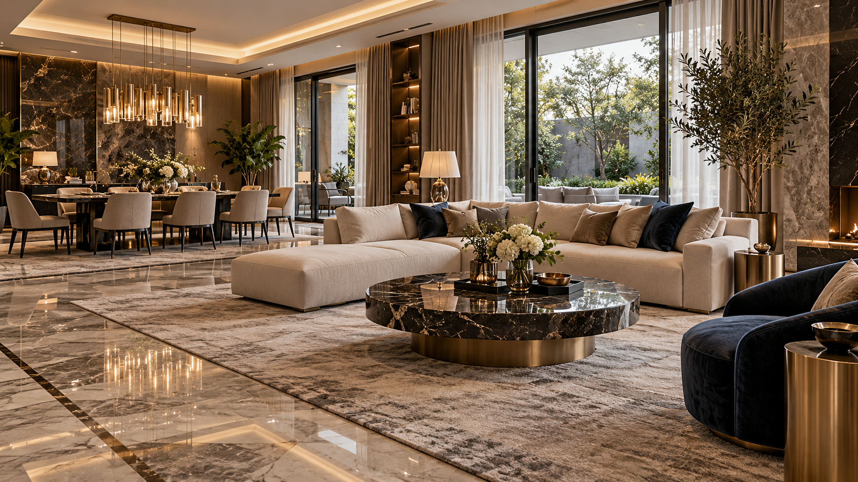
Photo By
A luxurious interior does not always have to be filled with gold. In fact, an elegant look is often created when the main colors, materials, furniture, and lighting complement each other in the right proportions.
From calming greige to bold navy, there are many luxury interior color combinations that can make a home feel more refined without looking excessive.
What Makes a Color Combination Look Luxurious?
Balance Between Dominant, Secondary, and Accent Colors
Use one dominant color as the foundation, then add secondary and accent colors in smaller proportions.
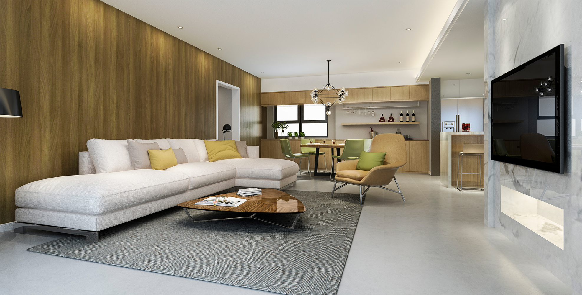
For example, beige can serve as the main color, paired with dark brown and subtle champagne gold details to create a warm yet elegant atmosphere.
The Role of Materials, Textures, and Lighting
Luxury is not created by color alone. Attractive material patterns, fabric textures, furniture finishes, and warm white lighting can make a simple palette feel more sophisticated.
Patterned granite can also help connect the different colors in the room.
Luxury Interior Color Combinations That Do Not Feel Monotonous
Warm White and Champagne Gold for an Elegant Look
Warm white creates a bright base, while champagne gold can be used as an accent on lighting fixtures, frames, or furniture details.
This combination works well for modern luxury living rooms.
Beige and Dark Brown for a Warm Atmosphere
Soft beige pairs beautifully with dark brown furniture. Add warm lighting to create a more intimate and sophisticated atmosphere.
Greige and White for Calm Modern Luxury
Greige is an attractive choice if you want a more understated luxury interior.
Pair it with white, clean-lined furniture, and glossy granite surfaces to add visual depth.
Charcoal and Metallic Accents for a Dramatic Look
Charcoal can be used as an accent color on walls or furniture. Metallic details and patterned flooring can help prevent the room from feeling too dark.
Navy Blue and Cream for a Luxurious, Characterful Interior
Navy adds depth, while cream keeps the space feeling warm.
This combination works well in dining rooms, family rooms, or foyer areas.
Emerald Green and Warm White for a Sophisticated Atmosphere
Emerald green can become a focal point through a sofa or wall panel.
Use warm white as a balancing color to keep the overall look light and refined.
Burgundy and Taupe for a More Intimate Interior
For lounge or dining areas, burgundy and taupe can create a warm yet exclusive atmosphere.
How to Match Interior Colors with Granite Patterns
Use Granite as a Base Color or Focal Point
Light-colored granite can serve as the visual foundation of a room, while more expressive patterns can become a focal point on the floor or wall.
Match Vein Colors with Furniture and Decorative Accents
If the granite has gold veining, repeat that tone subtly through lighting fixtures, cabinet handles, or furniture legs.
This helps create a cohesive interior without using too much gold.
Avoid Using Too Many Dominant Colors and Patterns in One Space
If the granite already has a strong pattern, choose simpler furniture and décor.
On the other hand, granite with a softer pattern gives you more freedom to experiment with furniture colors.
MAGIA Granite Options for Luxurious Interiors
To explore different design options, you can browse the MAGIA Granite collection, which offers a variety of colors and pattern characteristics.
White and Gold Patterns for a Bright Interior
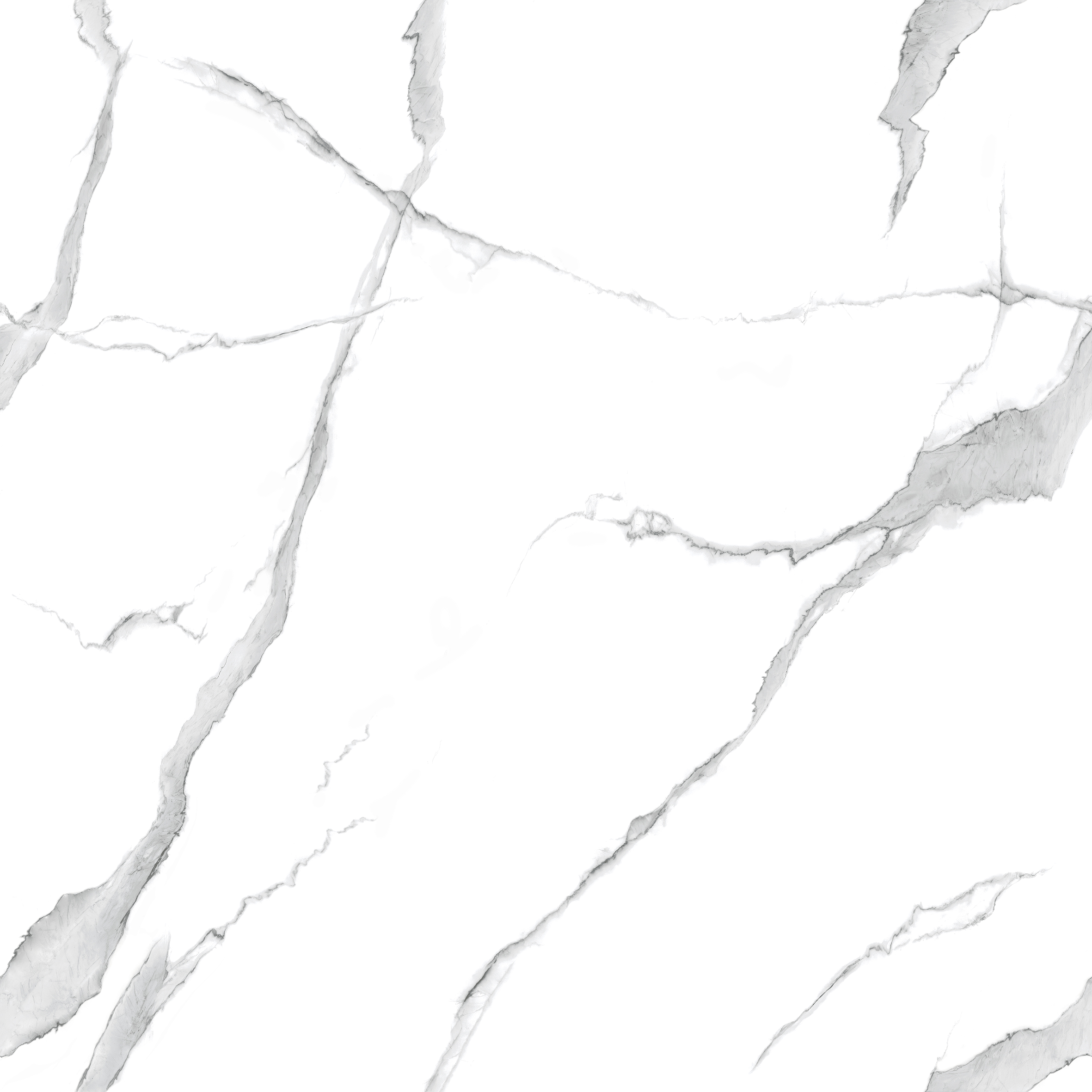
Branca Gold can be considered for white, cream, or greige interior concepts.
Its white base with gold veining helps create a bright room with elegant visual detail.
Dark Patterns for Greater Visual Depth
For a bolder interior, darker patterns with gold accents can be combined with beige, warm white, or neutral-colored furniture to keep the overall composition balanced.
Natural-Toned Patterns for a Balanced Look
Nebula Gold can be considered for taupe and brown palettes, while Danica Gold is another option from the MAGIA Granite Gold Collection for introducing gold details in a more controlled way.
You can also read the inspiration guide to gold-patterned granite for luxurious interiors for additional ideas.
Tips for Choosing a Color Palette Before Renovating
Start by deciding on the atmosphere you want to create, then choose the main color, flooring material, and furniture.
Also consider natural lighting, as colors can appear different in bright and dim spaces.
Once you have selected the right granite, use the MAGIA Granite Tile Calculator to estimate material requirements and make your renovation planning more structured.
FAQ
Does a luxurious interior have to use gold?
No. Beige, greige, navy, burgundy, charcoal, and emerald green can also create a luxurious impression when paired with the right materials and lighting.
What colors work well with gold-patterned granite?
Warm white, cream, beige, taupe, dark brown, navy, and charcoal can all work, depending on the granite’s base color and the intensity of the pattern.
How can I keep gold accents from looking excessive?
Use gold in limited amounts, such as in granite veining, lighting fixtures, furniture handles, or small decorative details. Keep neutral colors as the main foundation so the overall composition remains elegant.
Popular Collections





Related Articles
Inspiration
5 Stunning and Elegant Bedroom Ceiling Designs
16 Jan 2025
Inspiration
10 Ceiling Colors for Modern Homes
16 Jan 2025
Inspiration
5 Elegant PVC Ceiling Designs for Living Rooms
15 Jan 2025